

MASON VITAMINS REDESIGN
While working with my business partner under our boutique agency, Blue Dot Branding, we had the pleasure of redesigning an entire supplement line Mason Natural Vitamins is one of the largest vitamin suppliers in the United States with a selection of over 450 vitamins, minerals, supplements and herbs. Since they are a widely distributed both domestically and internationally, they challenged us to redesign the brand with a few non-negotiables: maintain their signature yellow label, amber bottles, yellow caps, and the logo must contain their wheat stalk. The result is a clean, modern brand that not only is distinguished on shelf but also online with prominent retail partners as CVS, Walmart, and Amazon. Take a look at their entire product collection on their website.

Mason Natural had multiple design styles throughout their broad vitamin and herb collection, which led to customer confusion and loss of brand identity. We were tasked to create a more cohesive modern brand for more than 400 products across 23 categories.

Brand Design
The end result is a clean, apothecary-influenced, timeless design. Categories are color coordinated by health concern which provides an organized and cohesive vitamin collection. The Mason Natural brand logo is quickly identified and is consistent throughout their entire sku collection. Also, Mason Natural can easily add new products into their lineup and maintain a visually unified brand.

Previous Collagen Category
Mason Natural’s previous collagen product suite included disjointed packaging design which created brand confusion.

Updated Collagen Category
We applied the brand design and formed a visually cohesive product suite that displays nicely collectively on shelf or individually. The gold metallic was retained to emphasize the higher price point and prestige product category.
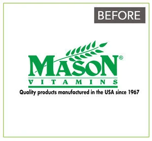
Previous Logo
Mason Natural logo existed for several decades and it required a refresh. They requested to keep the wheat stalk for trademark purposes.

Logo Design
We successfully modernized the logo providing a clean, approachable design. The "EST. 1967" was added to highlight their heritage of successful market longevity and consumer trust.